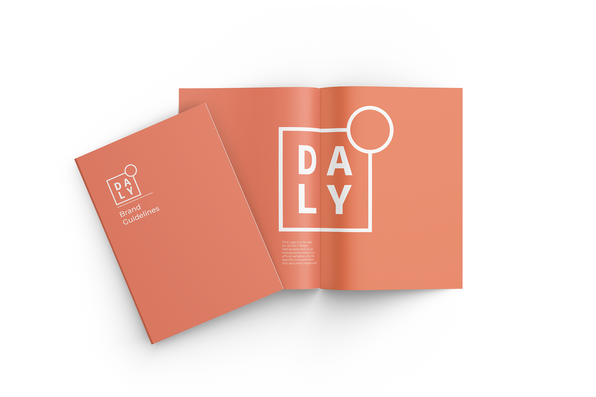
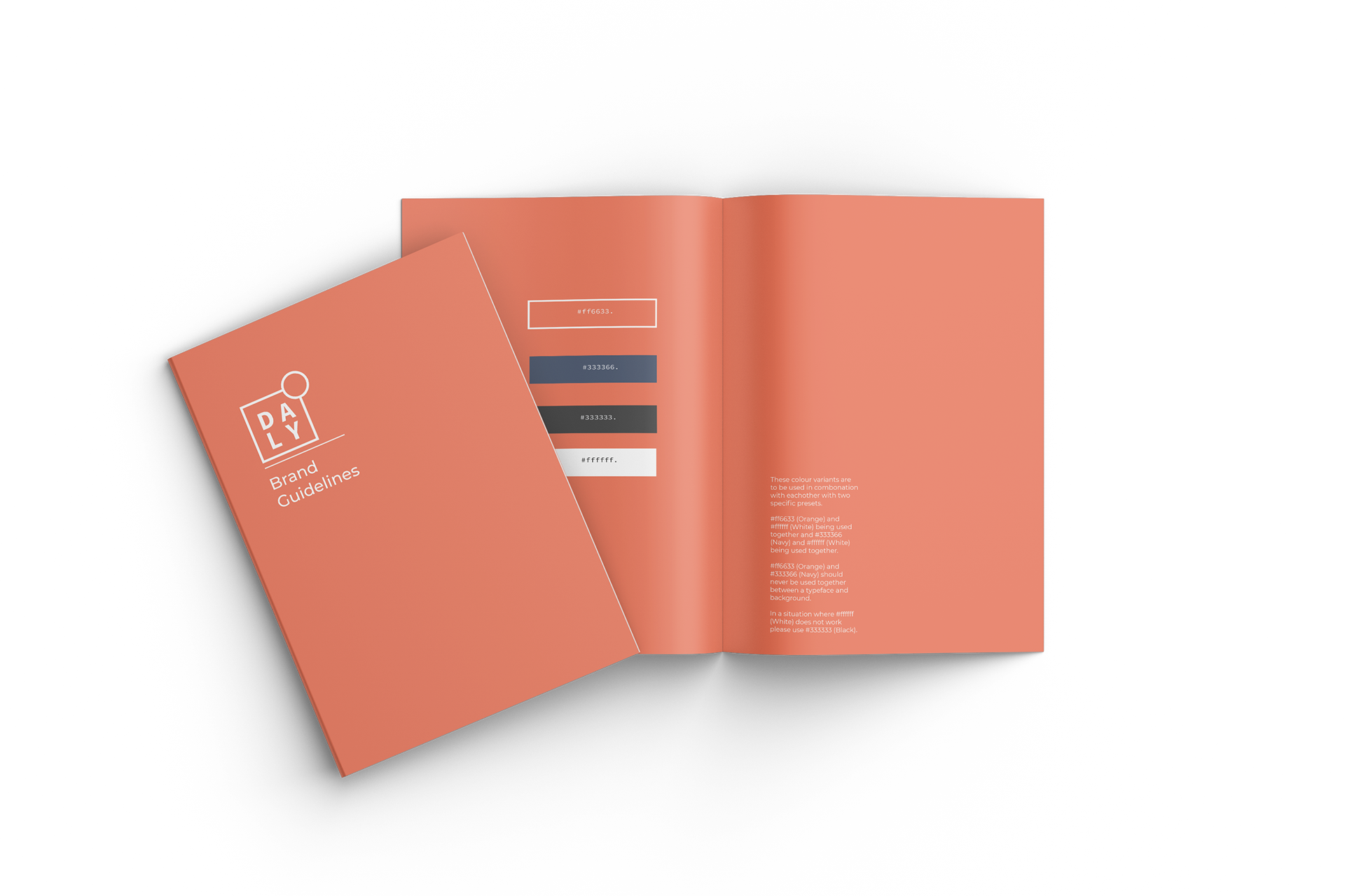
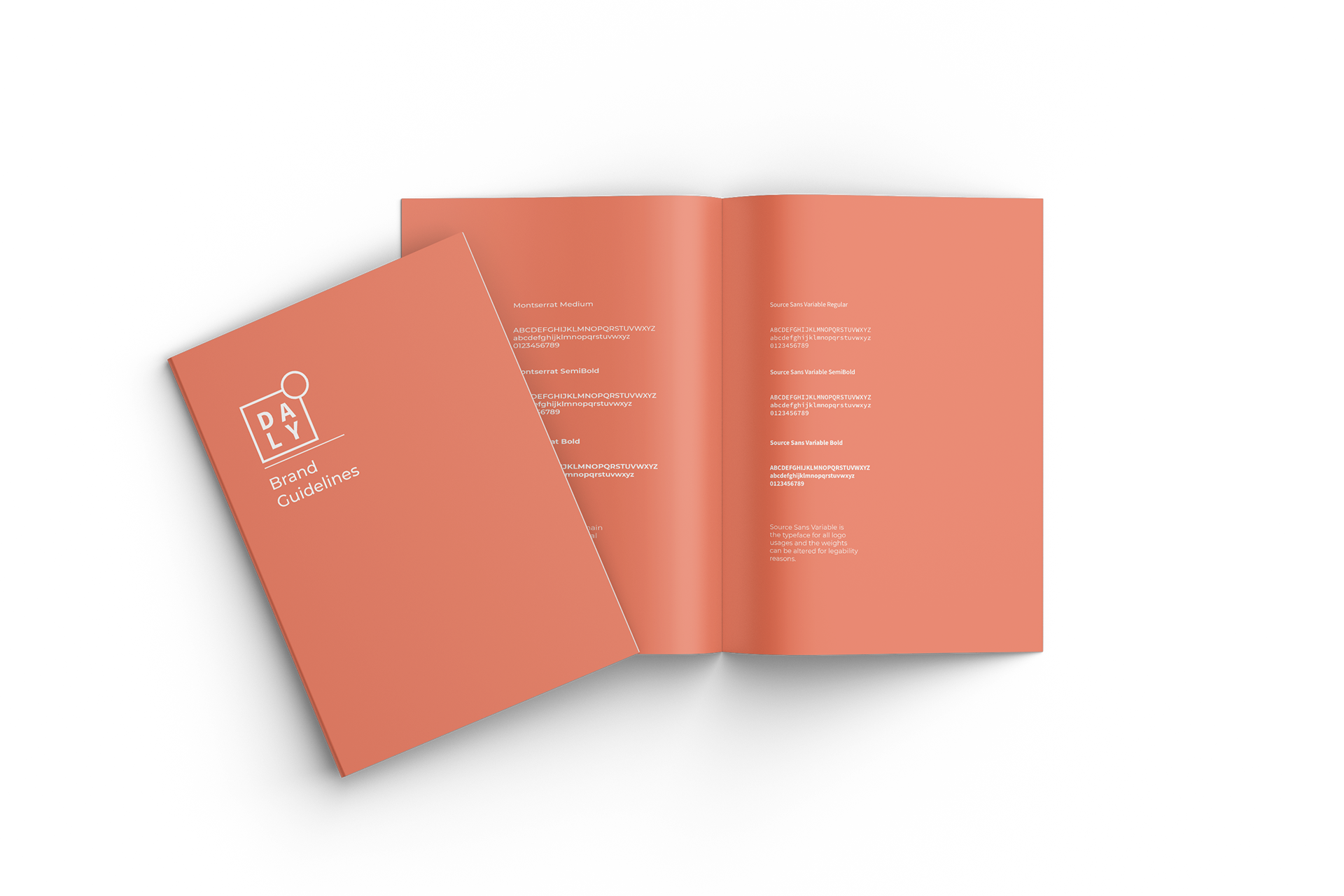
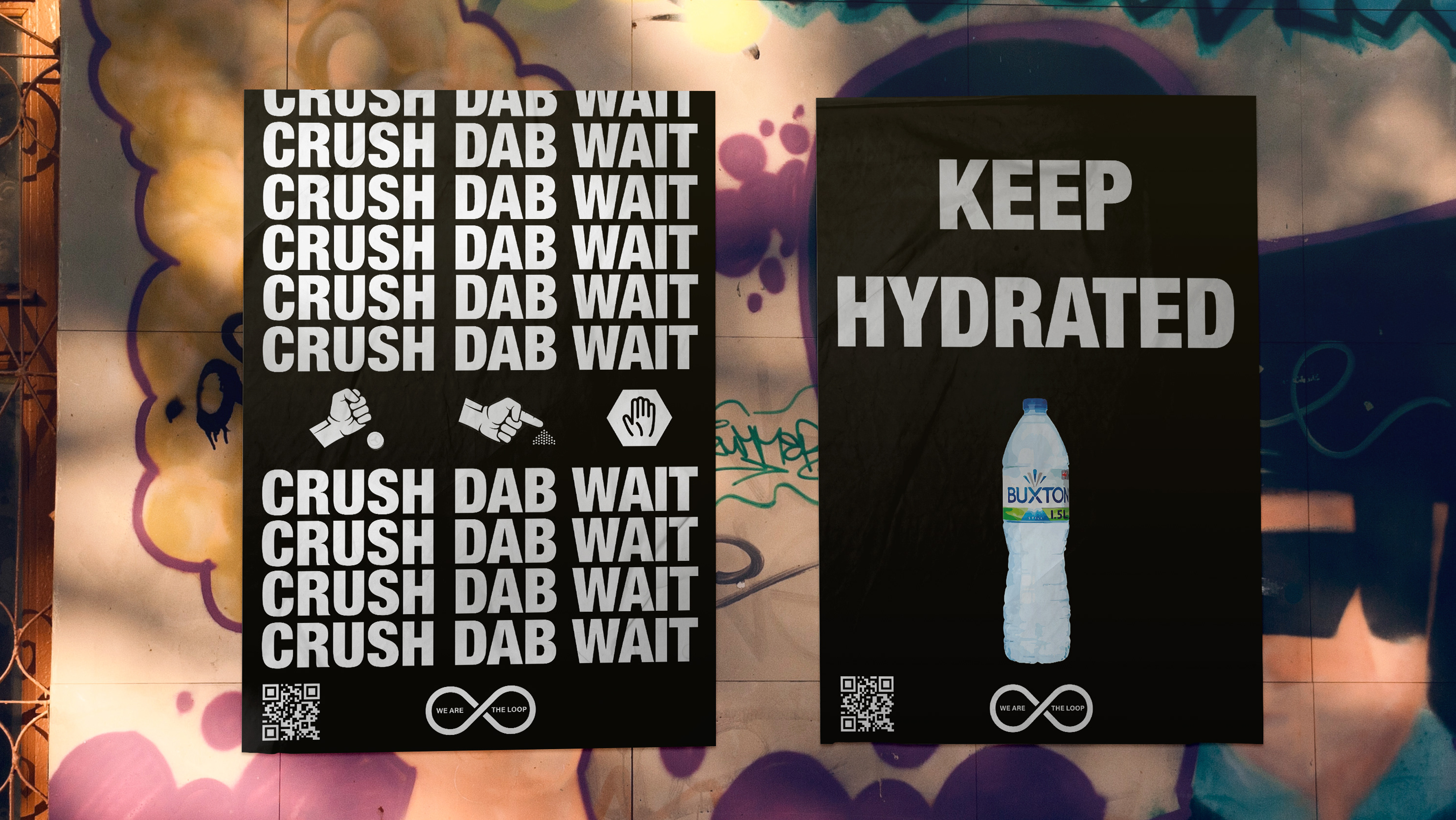
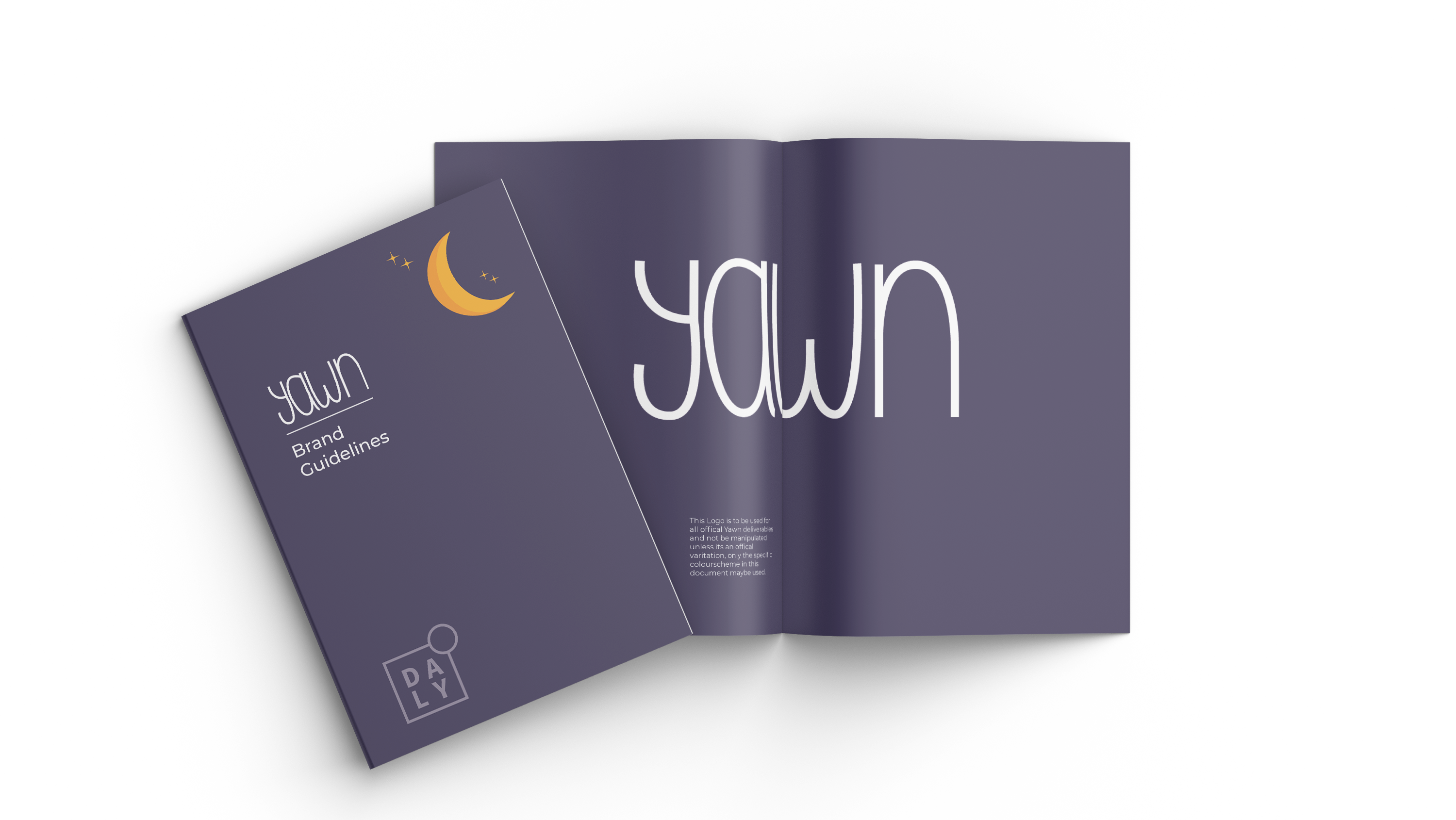
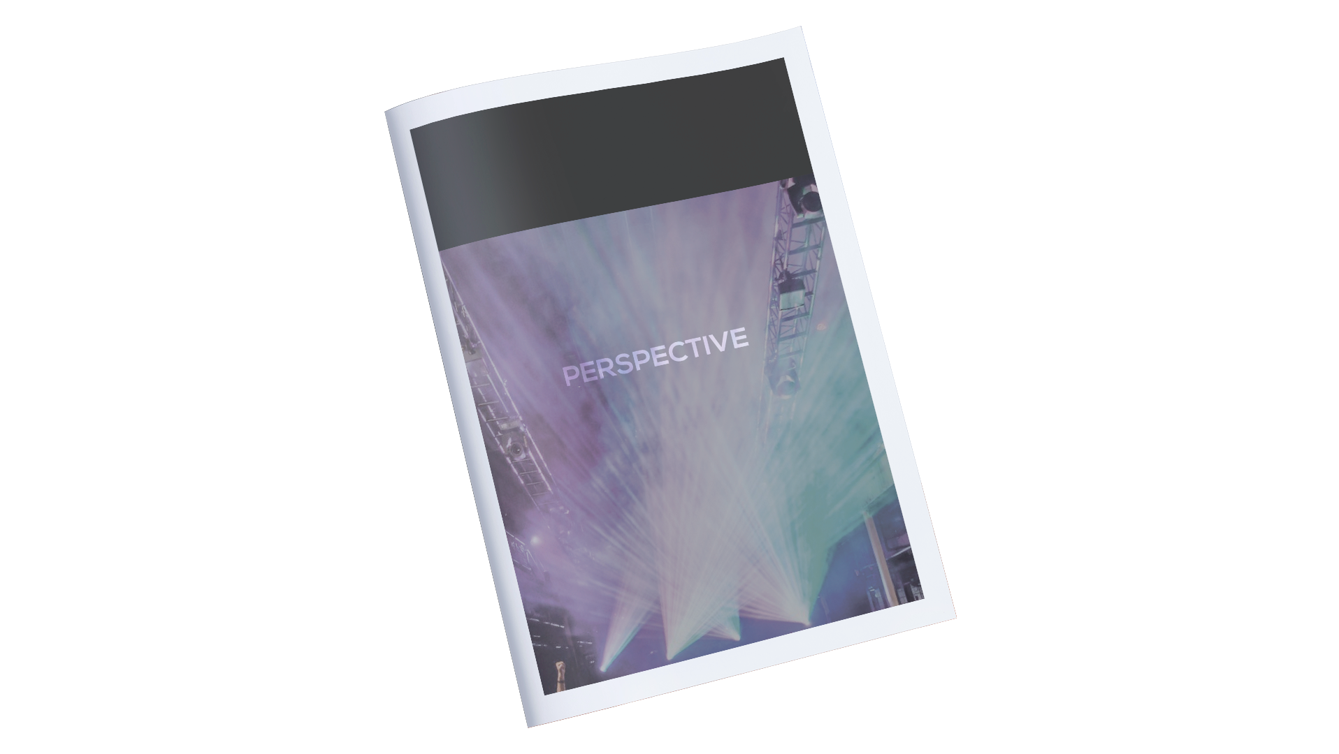
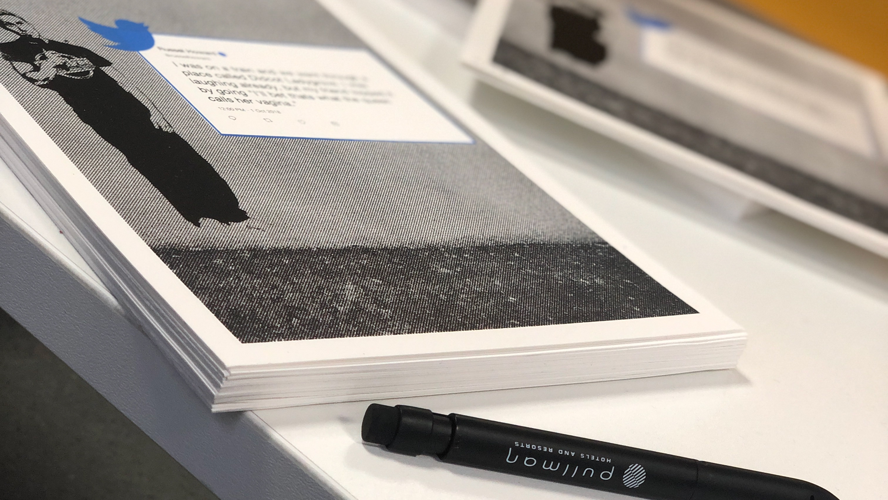
it important to be able to stand out in the design world and also represent me in some way, the idea was to keep things simple and professional taking a 50/50 approach balancing the use of typography and a symbol.
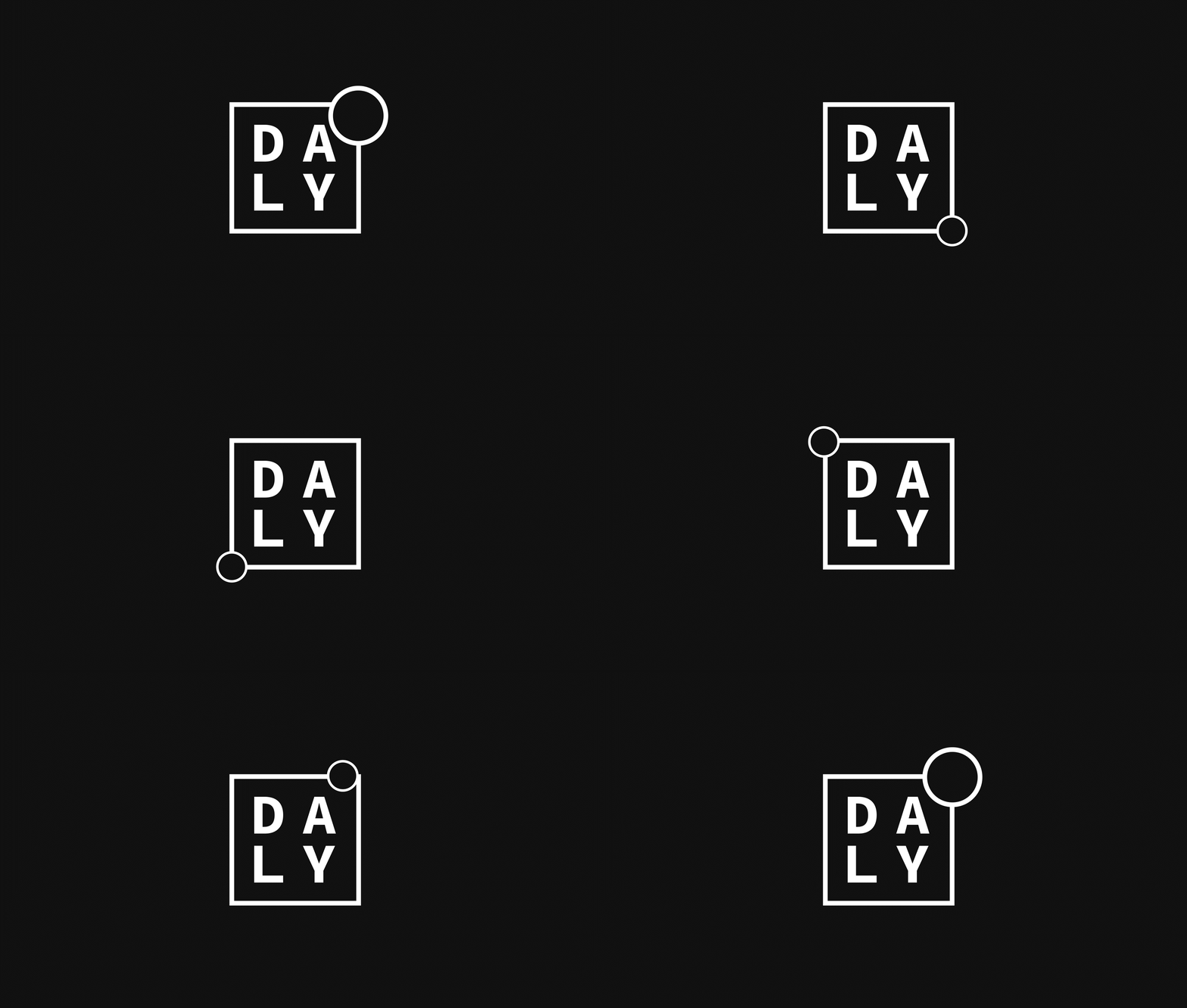
I developed an icon representing my cohesive ways of thinking but still represents my out of the box thinking to create new ideas but I also used the shape of the circle and square on top of each other to represent how I'm a designer who constantly building upon themselves as a person but also a designer.
